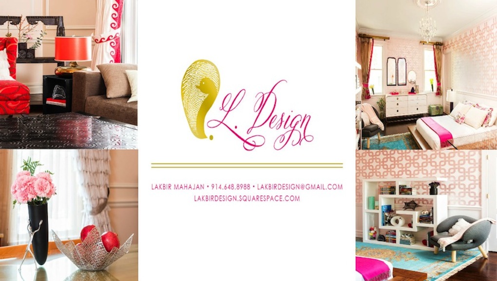
Originally we looked at many wall covering options. As I mentioned in prior weeks, the idea my daughter came up with was a bit harder to find in a wall covering with the colors she wanted. Of course her deciding on the metallic pink tones that resembled her iPhone was a challenge in itself to match. Teenagers are very particular with things, especially with trends like this, and since my daughter is a mature artistic sole herself, it had to be right.
The process of mixing the colors to get the right matches was a challenge and pleasing her creative eye was another! You can imagine how happy I was when she loved the base color. One hurdle overcome, now it was time to start the stenciling...

The stencil I designed was a series of links that would make up a 12" x 12" pattern and it would repeat. There was a small border that became apparent after we started applying the stencil and actually it was a nice surprise since I liked the effect. The bigger challenge was keeping the pattern straight around corners, door frames and switch plates. I decided to make a change at that point and keep it off the corners. It became much more time consuming than I imagined, which resulted in a cost factor with the time the contractor was spending. This threw me a bit over budget on money and on time than I anticipated originally. I decided to keep the pattern off the corners in the room and the door moldings as well.
I also decided it would be tasteful to eliminate the ceiling.The pattern started to look wonderful around all walls so I changed the concept accordingly.
I was also enjoying how the chandelier looked with the pattern itself. The pink tones against the crystal was more elegant than I anticipated. The dark wood floor will be a nice contrast to it as well.
So far.... so good. We have overcome some huge challenges and I am anxious to see how this progresses. I am also excited to share it with you in following weeks. Stay tuned!
Please leave your comments and suggestions below along with any questions you may have.
#oneroomchallenge, #housebeautiful, #LakbirDesign, #home, @oneroomchallenge, @housebeautiful, @LakbirDesign


That stencil looks great. I hate doing them though...such a pain in the ass.
ReplyDelete